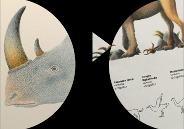
Here’s the report of the BCBF visual identity work group.
"We have always seen the Bologna Children's Book Fair as a multifaceted place, changing, dynamic and eclectic, rich in content, workshops and speakers.
In the past editions the identity of the event has always been characterized by the the use of icons and type design – pure illustrative art had never been used. Perhaps this was a way not to overlap with the huge number of signs in the fair or because illustration is hard to be conceived as a graphic language tool, used for way-finding systems. Design schools still teach graphic design and illustration as two separate fields...
We could go on and on about this, but this is not the place. Surely these are the thoughts that we have gone through when we found ourselves around the same table, graphic designers and illustrators, to identify the strategy and build the visual identity for the 2017 show.
We did not want to fall back into the classic working format in which the illustrator makes a drawing and the graphic designer adds words and puts it all in a layout. We wanted to use this opportunity to interact and multiply the potential of all visual languages. We wanted to accompany the visitor to the fair with illustrated images that work in synergy with direction signs, identify physical spaces, and different types of content.
We wanted to build an identity as flexible as an alphabet, as strong as a brand, and as capable of telling stories as a novel.
The challenge was formidable, but we soon found that to tell and represent the cultural machine of the Bologna Children's Book Fair a single image would not be enough: it was necessary to create a system of images linked in some way to each other. The whole identity would work between the central figurative image, unique and memorable, and a number of its components, easily linked to the core image and, at the same time, be able to tell and guide the visitor by giving visibility to the wealth of individual stories present at the fair.
We tried to build this system of narrative plots, we got lost between singularity and plurality, we tested interactions between typography and illustration, we investigated what binds a group... and then came upon the mythological animal of the “Chimera”. The intuition of Daniel Castellano has informed the strategy, the dialogue between the languages and flexibility of use.
The Chimera has allowed us to gather in one body the central soul of the Bologna Children's Book Fair and at the same time, through the singularity of the 5 fantastic creatures that it is made of, give voice to the stories, identities, and imaginary worlds that inhabit this unique event.
The Chimera provides publishers, illustrators, agents, journalists, industry with a memorable figurative interpretation of all of these places. As a visual experience, the Chimera will settle in the visitor’s memory as a representation of Bologna Children's Book Fair as a special place brimming with projects of great imagination".

CHIALAB
Chialab is a design firm that pays the utmost attention to the visual aspects of communication. Concerned with the visualisation of information on paper, in space and on screens, they create visual identities, as well as tools and processes to manage them. They design and develop publishing and reading systems for digital publishing. Chialab likes to share its knowledge.
Chialab will be at BCBF 2017, here the chialab events.
DANIELE CASTELLANO
Daniele Castellano was born in Rimini in 1989. He studied painting at the Academy of Fine Arts of Brera and illustration at ISIA in Urbino. In 2016 his works were selected for the Illustrarte Exhibition and for the Bologna Children's Book Fair illustrator’s exhibition. He currently lives and works in Bologna as a freelance illustrator. He collaborates with various independent Italian publishers, R+N Publishing House, Einaudi Ragazzi and Mondadori Electa.